A personal identity project built in two parts — first designing a signum, then putting it to work. The assignment started with creating a personal lettermark from my initials, and ended with a complete stationery set that applies that mark across letterhead, envelope, and business card. The result is a cohesive personal identity system that functions as both a design exercise and a real-world professional tool.
The Challenge
Designing for yourself is deceptively hard.
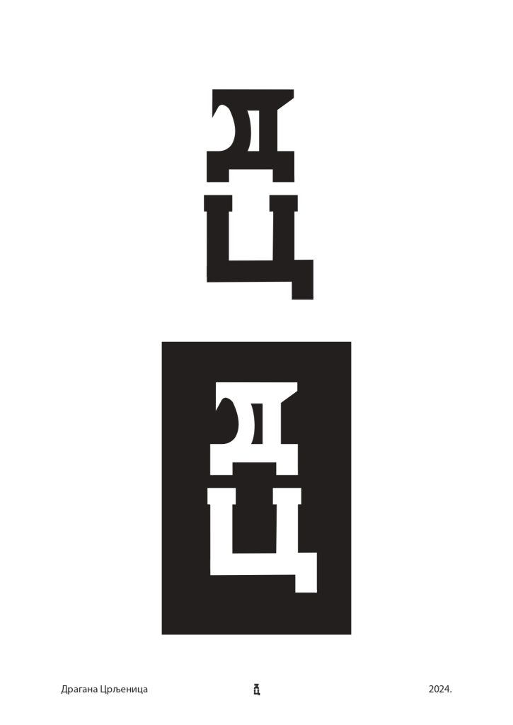
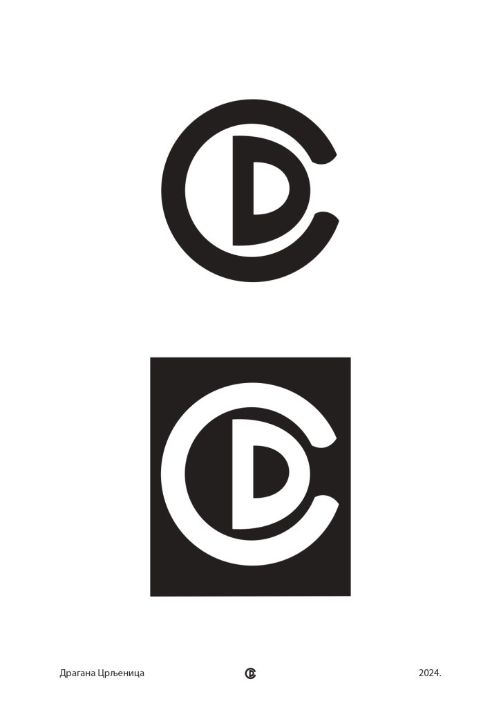
The signum had to integrate two letters into one unified form — not just layer them on top of each other
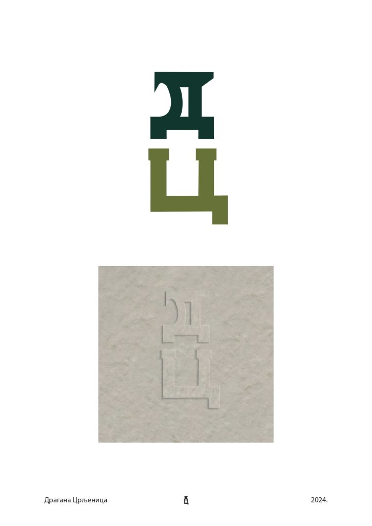
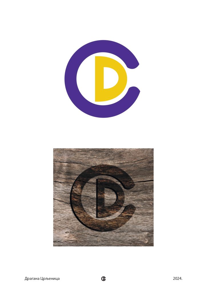
The mark needed to hold up at small sizes, on dark and light backgrounds, and across different materials
The stationery system had to feel cohesive across three completely different formats and paper sizes
Every decision had to work in print, not just on screen
The assignment also required researching what separates strong signums from weak ones — which meant developing a critical eye before picking up a pen.
My Approach
01. Signum Development
I started by building the visual core, a bold, rounded navy wordmark paired with a lime accent that’s impossible to ignore. Every decision was made to feel handcrafted but intentional, playful but polished.
02. Variations & Material Testing
The mark was developed in black and white as the primary version, with a color variation and material mockups on wood texture and emboss — testing how it behaves beyond flat digital applications.
03. Good vs. Bad Signum Research
Part of the assignment was identifying what separates effective signums from weak ones. Strong marks integrate letters structurally — they share geometry. Weak marks just overlap letters without any real connection. That research directly shaped every decision in the final mark.
04. Stationery System
The signum was then applied across a full stationery set — letterhead, envelope, and business card — built around a warm cream and terracotta palette with navy as the primary color. The organic wavy pattern adds character without competing with the information. Same palette, same mark, same logic across every format.
The Results
Unified Lettermark
C and D integrated into a single form that works at any scale, in any context
Multiple Variations
Black and white, color, and material mockups demonstrating real-world versatility
Complete Stationery Set
Letterhead, envelope, and business card designed as one cohesive system
Research-Informed Design
Good and bad signum examples analyzed before a single form was drawn
What Made This Work
The signum works because the C doesn’t just sit next to the D — it encloses it. The relationship is structural, not decorative. And the stationery works for the same reason: restraint. The cream background, the navy mark, and the terracotta pattern do all the work. Nothing competes, everything connects. Designing for yourself forces you to make decisions you can actually defend — which turns out to be really good practice.