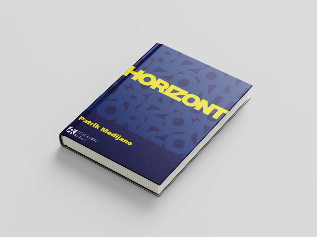
A book cover design for Horizont by Patrick Modiano, created as a university assignment with one strict constraint: the entire design had to be built using typography alone — no illustrations, no photography, no graphic elements. Just type, doing all the work.
Designing without visuals sounds simple until you realize how much visual designers rely on them.
The constraint wasn’t a limitation — it was the whole design problem.
I treated the title itself as the visual. Horizont repeated, scaled, and layered across the cover becomes texture, atmosphere, and identity all at once — the word is everywhere, and yet you’re still searching for it, which felt right for a book about memory.
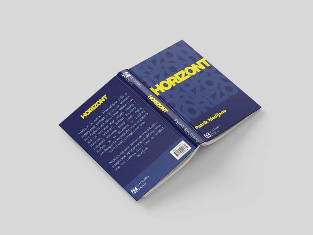
The title is repeated at large scale across the front and back, creating a pattern that reads as both background and foreground simultaneously. The layering mimics the book’s themes — fragments of something familiar that you can’t quite fully grasp.
Deep navy and sharp yellow do the heavy lifting that imagery can’t. The contrast is bold enough to stop someone in a bookstore, while the navy background gives the cover the weight and seriousness the book deserves.
Despite the visual density of the repeated type, the actual title and author name remain immediately legible — achieved through scale contrast, weight, and color isolation. The cover is busy, but it’s never confusing.
Front, back, and spine designed using exclusively typographic elements
Repeated title treatment creates atmosphere without relying on illustration or photography
Title, author, and publisher information remain immediately readable within a visually dense composition
Visual language reflects the book's themes of fragmented memory and identity
The constraint forced a more considered relationship with type than most projects allow. When typography is your only tool, every font choice, every scale decision, every spacing call has to carry more meaning. The repetition of Horizont across the cover isn’t decoration — it’s the concept. A word that’s everywhere and nowhere, just like the memories the book is about.